
The method of designing a logo and formulating or refreshing a brand is a practice that I have become much more comfortable with over the years. The identity of a business and how that business is characterized by the world is, at first glance defined by their logo. I’ve put down our experiences collaborating with clients into the form of a ten point list below.
1. Getting to know the client & their nature
I find that before we even get started with a project for a client of any type, it’s important to get to know them. This is specifically true when it comes to developing a brand identity or a logo for a client. I usually prepare some questions to ask specifically for each client. These questions can be broad and specific to their industry, what they want the logo to accomplish and about their personal tastes. Every client, in my experience, has brought a unique frame of mind to each project. Making each experience a little bit different.
Some people want to be in control of the project. They approach me with a whole bunch of ideas sketched on a piece of paper, created in MS Word or maybe something that they have created themselves but want us to refine.
Other clients have no idea what they want. Often they have looked at our portfolio and were impressed one way or the other and want us to “Go Nuts” and create something that is 100% our vision. Of course this is an ideal scenario! There is nothing like an ego boost, right at the beginning of a project.
There are some clients that have asked us to take inspiration from a certain brand that they have always admired, and put our own spin on it. It’s fun to do this, keeping in mind that it’s very important to keep your work fresh and unique.
One thing that we experience almost every time is that clients, whether they are a corporation or a small business, are protective of this asset (in progress) and everyone involved on the client side is going to be really critical of this process. Chances are this logo will be around for a very long time, so it deserves extra attention.
2. Getting to know your clients industry & competitors
There is significant value that can be gained in seeing what other brands are out there. This is an excellent way to start your research. You would by no means want to come to the table with a brand that is reminiscent of something else in the same industry. This process will prevent that from happening and it could save you from embarrassment.
I’ve noticed that certain industries to have many similarities in their branding. Industries tend to have common colours that we see repeatedly in logos. Green communicates nature, heritage and comfort. We find green in logos for health food, rugged vehicle and hospitality industries. The colour blue has been associated with dependability, communication and well-being. We see Blue in the logos for software and finance companies. Red is an “attention getter”, it’s been associated with hunger, life and passion. You can see red brands in many different industries such as food & beverage .
It is also very important to keep in mind your font choice. For instance a client in the financial industry will likely be expecting you to use a more formal font, as these are considered to be trustworthy. There are typefaces that convey femininity, playfulness, strength and prestige. Basically if you want to use a font to tell the story there is indeed one for every story. Just don’t be too obvious and try not to use “cheesy” ready-made fonts for a logo that is supposed to be custom or specific to the client’s vision.
3. Deconstructing the words & letters
We like to look at the company name in pieces and see if we can make a connection with a metaphor or a symbol that is reminiscent of the industry or identification that the client may want to convey.
You can see that as an example in the Shift 8 logo. The letter “i” is dotted with an asterisk, which is what is returned when you type shift+8 on a keyboard. This can be one of the really enjoyable parts of this technique! If you give yourself the chance to really use your imagination you can refine your ideas later on in the process.
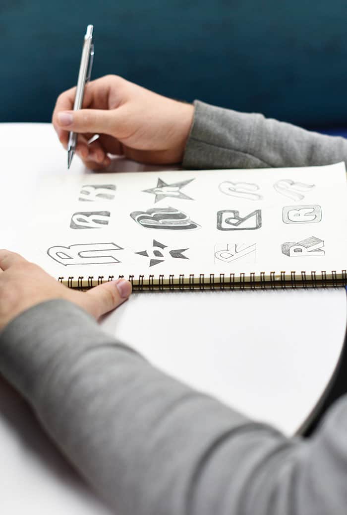
4. Putting pen to paper
It’s important for us to sketch ideas out on paper. I appreciate the tactile contact of pencil or pen to paper that allows ideas to flow out without being distracted by the mouse, keyboard and (most importantly) monitor.
I’m aware that every designer has their own process, but for us this is the most efficient way to get things going without worrying too much about the form of the design, but really getting the concept down.
5. Refining a design sketch in Adobe Illustrator
I would say that 98% of the time we utilize Adobe Illustrator to refine initial ideas into graphic elements. The remaining logos that we have designed have been done in Adobe Photoshop. Illustrator allows us to create a logo that is a vector object, so that it can be resized and still retain the exact quality is intended. Although I can understand why someone would want to create a logo in Photoshop, I would advise you to make sure that this is the right decision before you put too much time into it.
6. Selecting some appropriate fonts
I think it’s important to try out a few distinct typefaces. Sometimes when we’re working on a logo and testing out fonts, it can feel like we’ve been sucked into a black font-hole. There are so many options and time can really slip by during this part of the process. It’s really important to keep your fonts as organized as possible so that you can go through them seamlessly and easily to find what you are looking for.
7. Options, option & more options
We have had the most promising results when we have provided our clients with a lot of great options to choose from. If it’s more options than what was itemized on the original proposal, we don’t mind putting additional time into this process. I think it’s important to feel satisfied that you and your client have explored the subject fully. We usually create a AI document with a number of art boards which makes it easier to create a number of logos with slight (and not-so-slight) variations.
8. Selecting a colour scheme
We usually decide on the colour scheme early on or right at the end. Many times we are told which colours we should be using from the start. Larger organizations will typically already have a brand guide stipulated before we even get started.
Regardless of when the scheme is chosen, this part of the process is crucial. The colour scheme will be in play through the entire brand. You will want to select colours that will look perfect, whether they are being shown on a laptop screen, a smart phone or a billboard along a highway.
There are many resources that you use to create colour schemes. My go-to website is Colour Lovers. On this site, there are libraries full of colour inspiration and you can even create your own palates.

9. Presenting my logo creations
We like to provide clients with a PDF of all of the logo examples that we have created on a simple white background. We will also provide clients with a mock-up of what their logo options will look like in a real life scenarios (newsletters, business cards, coffee cups, stickers and everything in between).
In our presentation to the client, we put some time into describing what we like about specific logo options, pointing out small details that the client may not have picked up on. I think its important that we clarify to the client which of the examples we prefer and why.
From this point we ask the client to give feedback. This is easier if its organized in regimented “rounds” of revisions. In-house meetings are easier in terms of communication and flows of ideas. If that’s not possible a conference call is ideal. If even that is not possible, you could use a collaborative web based tool like Red Pen to make it easier for the client to write notes on each asset. The key is that we will revise until the client is 100% happy with what we have created.
10. Preparing all file formats for delivery to the client
Logos are used in many different applications, so we like to make sure that when the logo design process has been completed, the client is left with every different file type that they may need, whether it’s for web or print.
It’s important to us that the client knows that if they need anything else from us in the future, that we are just a phone call or email away.
—
Hopefully this information helps someone in their journey as a designer! The process of collaboration with clients is definitely not an exact science.